Concept Pitch Boards

Wednesday, 26 February 2014
EOYS Progress
After Shoot
After photographing the petal typography I edited and combined the best of the images to create the image below. The quality is good enough for the concept pitch but if this is the route they choose we would have to shoot each letter with the help of a photographer to ensure that the image doesn't pixelate when it is scaled up to large poster sizes.


Building from this we developed further promotion and visuals for the concept boards.
Friday, 21 February 2014
Concept #2 Design Boards
Our second concept 'It's Grim Up North' design boards, designed by Sam Lane
Thursday, 20 February 2014
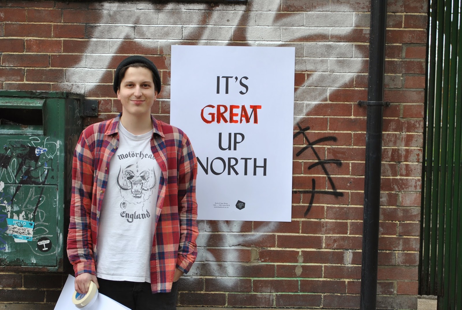
It's Grim Up North Photoshoot
To illustrate our concept that the word 'Grim' would change to 'great' over time (a few weeks after the posters have been left up) we went out to paint over some print outs of the poster.


This is how the poster will look when it has been intentionally vandalised


Team photos:


Secret 7" Submissions
Building from the themes of the song which revolve around the problems with media and politics I started by manipulating images in a dark and experimental way.


Taking a political speech by Nick Clegg and converting it to a .RAW file and opening in Photoshop resulted in a page of white noise that looked loosely like a pool/ sea filling up with water from the rain.

Adding a drowning man's hand gives a loose message of being surrounded by media and losing sight of what's important.
To give the image more attack and a bit more of a retro/ vintage feel to compliment the legacy of Black Sabbath I photographed my hand and made it black and bright red.


Elbow - Grounds for Divorce
Taking the title of the song relatively literally I based this idea on a ring's motion as it falls to the ground. Using the extrude and bevel tool I manipulated an illustration of a ring to look as though it was rotating in various directions.

The shading looked cheap and too digital so I flattened the graphics.

To make the artwork less obvious and more interpretative I changed it to a less obvious wedding ring


Wednesday, 19 February 2014
Logo Refinement / Web
After meeting with Flicky to look through the four concepts I put together for her she was happy for me to develop the postal stamp idea.

This is how Flicky's Cargo will look, it would be good if the user could click and drag the stamps around to make it more interactive and unique.


When the stamps are clicked it will link to a new page that displays large images that you scroll downwards through.


I think it would be safer to put a slash after 35mm to make it clear that Flicky does both and so it can't be confused as a 35mmDSLR

Image Manipulation Experiments
As part of the Black Sabbath submission I am going to manipulate images of political figures to illustrate the song.
To make the manipulation fully random I have experimented with chopping and changing the code by opening the image in Text Edit


This method produced interesting results but you have little control over them.
Although this may not be suitable for the album artwork, elements of it could be used as alternative promotional material.
Although this may not be suitable for the album artwork, elements of it could be used as alternative promotional material.


Petal Test
Testing
Before going into the studio I tested to see what size the type was going to have to be for it to be legible.

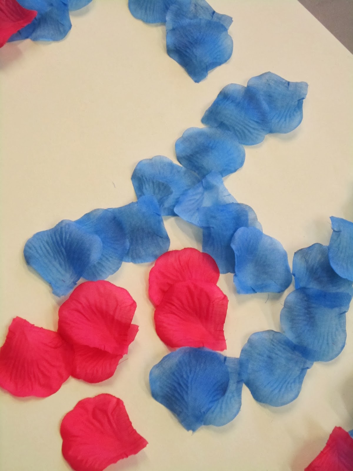

I then tried printing off a template to see how the petals would work with the cursive type.
I had to cut the petals into halves for it to be fully legible or else it would have been too big to photograph in the studio.


It should look good in the studio with lighting, a better camera and more time taken constructing the typography.


Subscribe to:
Posts (Atom)