Saturday 30 November 2013
Friday 29 November 2013
DR.ME: Make a Flag
Flags
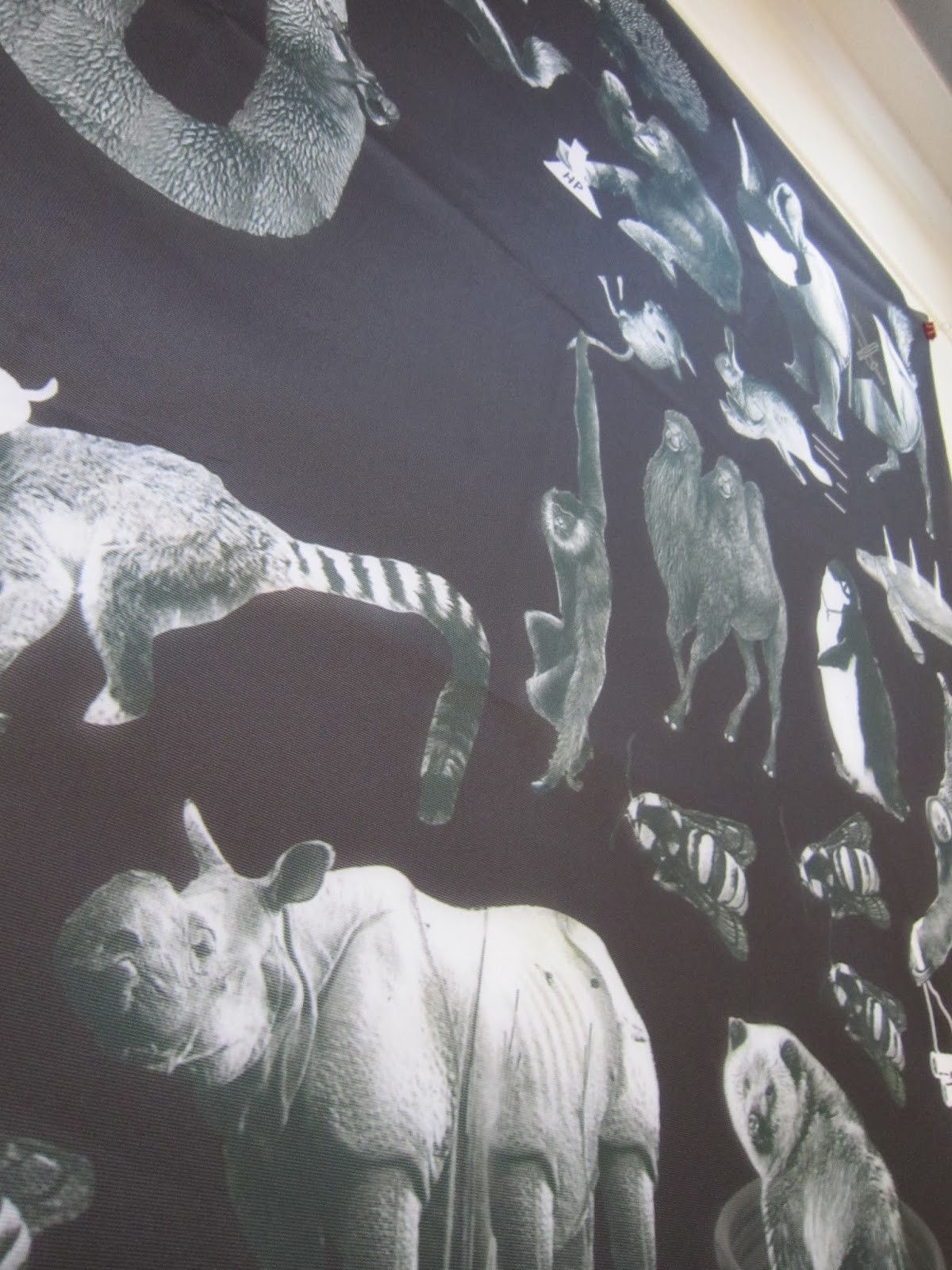
Working with Mikey Scott this brief was simply to make a flag which will be featured in an exhibition at Islington Mill in Manchester on the 13th of December. We wanted to make a flag that would be fun and interest and would appeal to people. After mind mapping a load of ideas we decided to develop the idea of using the flag as a graph that has my interests on the X axis and Mikey's on the Y axis and then the final flag would be a visualisation of our favourite and worst things. After testing a few potential topics we decided to run with the theme of animals as this would have wide appeal and we felt as though there are some animals that need to be put in their place as baddies.


The workshop was about being hands on and trying new things so, as mine and Mikey's style of work is quite different we decided to try something that neither of us had done before, we scanned in 50+ images of animals from the library and printed some found imagery from the internet. After cutting them all out we began to rank them in accordance to if we thought they were bad or good.


As the idea developed we decided to introduce a Good Vs Evil vibe which escalated into a war between the two opposing sides of good and bad animals.


Details from this finished flag:


Photos of Printed Flag here
Photographs


Scale


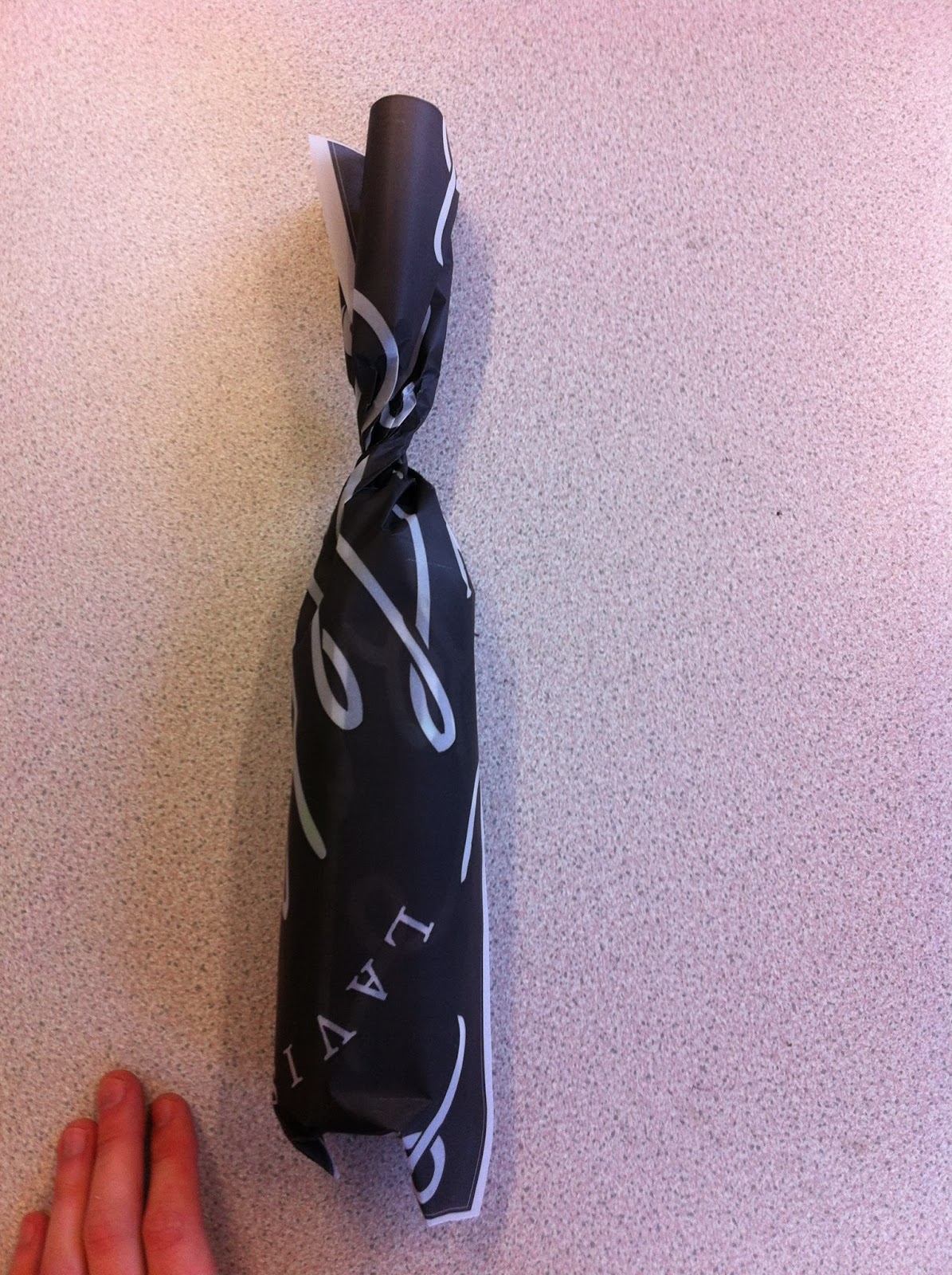
Paper Wrap Testing
Paper Wrap
For the wrap that is going around the bottles I need to use a stock that is flexible but also quite strong.
The paper wrap would only be used for photography purposes and possibly for limited edition or special occasion drinks.
Bulky Newsprint
Straight away after testing this design I think that it is too confusing what it is, it would possibly work better if the logo was smaller so that it is obvious what it is straight away, or alternatively I could print big stickers to put on the outside.

Bulky newsprint is too rigid and rips easily

Sugar Paper
This is the best stock option so far, as it is quite flexible and also doesn't rip as easily


Inverted Colour on Sugar Paper
I also scaled down the design a bit so that you can see more of the logo,
This makes more visual sense but the stock is still quite hard to work with
This makes more visual sense but the stock is still quite hard to work with


Trace
This is easily the best option, it is very flexible and strong enough to hold together. If I combine the scaled down design with the use of tracing paper I think that it will work well.

You can also see a small part of the contents inside which make it a bit alluring and sneaky

Additional Material
Swing top seal
To be stuck over the lid and swinging arm, seal is broken when drink is opened

Alternate logo
To be used in place of the main logo at small scales

Hang tab
To be tied around the neck of the bottle with string on a material-like stock.

Rear Label
To be stuck on the back of all bottles to illustrate how the bottles would appear if they were to be produced

Paper Wrap
Printed onto a matt paper, wrapped around the bottles and tied with string

Label Development
Bottle Labels
I am going to design a range of four labels for four different flavours of milkshake. They should work as a consistent set whilst also being recognisable individually.
PICTURES OF SUPERMARKET SHELVES HERE

I think this looks slightly too 'cow-ey' and childlike

Using a more traditional lock-up with a serif typeface gives the label a more adult feel

I played with the idea of having some drips at the top of the label to give a clear indication of colour and flavour, however this may take away from the impact of keeping it simple


Hierarchy
The top left label is what I started with and from a distance there isn't enough impact, due to a lack of hierarchy in the type and all the stroke widths are similar. Creating a variety of options allowed me to see what worked at a small scale

Elements
These are the smaller logos that will accompany the main logo

Logo posters for the drink. The white version could be extended to promote a range of lighter options.

The final set of 4 labels. I decided not to go with any drips in the end because I am planning on using a wax stamp above the label and I think that them both together will make the bottle too cluttered and messy.

Multi Pack Packaging
Bottle Carrier
I am going to design a bottle carrier for the milkshakes for multipack purposes. This will most likely be seen on the unrefrigerated shelves of a supermarket rather than in the fridge like the individual bottles.
Although this looks good, it would be extremely expensive to mass produce and would only be viable in packaging high quality spirits that sell from £25

These are traditional carriers used for carrying milk, they would look good for illustration and photography purposes, but, considering I want to develop a packaging based portfolio I think that it is important to be able to design realistically, and make the products suitable for mass production.


Design sheets outlining label layouts and carriers


This is the basic scamp for the bottle design, it will be a swing top bottle, with a wax seal on the bottle neck, potentially dripping onto the label, there will also be a thin strip of paper that needs to be broken by the swing top.

From the book 'Special Packaging' I found this net which makes a basic bottle carrier

After constructing the net I removed any parts that I didn't think we're necessary and modified some parts that didn't quite match up.


Editted Net

The finished carrier will be printed on heavy stock and also printed double sided so the entire carrier is black.

Printing the design and assembling it allowed me to quickly see what makes sense and what doesn't that is hard to imagine on an unfolded net.
For example I think it would make more sense for the bar code to be on the left and smaller than it is, especially considering this is to scale and will be much bigger.
For example I think it would make more sense for the bar code to be on the left and smaller than it is, especially considering this is to scale and will be much bigger.

Also little details like this logo is slightly to high up on the face

After making these changes this is the finished carrier net:

Subscribe to:
Posts (Atom)