I wanted some tag lines to go with the Bamdoodle brand that communicate the silly and fun nature of the products.
Playing on the flat pack nature of the product I thought that 'Jigsaws for grown ups' or 'Half baked furniture' might be quite fun, but the one i like most at the moment is 'Wood for your bum', because it is silly and a bit rude which I think will appeal to the Bamdoodle audience.
I quickly made the letters that I didn't already have from the logo (I will spend more time making this a full typeface if Ryan approves it)

If this type is to be used on the speech bubble business card idea then it will have to slant the opposite way

I will try this out with a variety of typefaces to see if Ryan prefers a different style.

This is how the type looks when slanted backwards, which I think is a pretty cool business card, straight to the point, intriguing and not a lot of information, we could even get rid of the phone number as I doubt anyone would use it.


To cust down costs and add a hand crafted element I like the idea of just printing in black and white and then going over each business card with a highlighter to make it really stand out.

The business cards will be made in a triplex format with the laser cut top layer showing the colour through the counters of the 'B'

Coin Box
Seeing as though the 'Skube' chair has an obvious resemblance to a coin box I thought that might be quite a nice promotional product, we can print the nets onto card flyers and perforate the edges so the user can pop them out and construct them, using small velcro pads on 3 joining areas will make construction easier and will eliminate the need for the user to get out a glue stick.
This hands on, interactive element is relevant due the d.i.y approach to the furniture.
This was the first design, which on screen looked quite good but when constructed looked sparse and confusing


I simplified the design a bit and incorporated some of Ryan's doodles that he is printing on the chairs.

This was much more effective and if it was printed on nicer stock with a richer black then I think it would suit its job well.


After choosing the colours that are going to be associated with bamdoodle I have revisited the coin box and tried assembling it.


The promo coin box will come as easy to assemble as possible with perforated edges and score lines made

The instructions are as easy to follow as possible

The net pops out relatively easily from the surrounding card


When fully out I realised that some of the score lines were too deep for the stock which i will remember when producing the rest

Using double sided tape the box assembled quite neatly


After re-thinking the promo coin box idea, I thought that not many people would bother going to the effort of fully assembling it and getting it out of the perforated card was a bit fiddley. I decided that if it was already folded and double sided tape on it people would be more likely to assemble it.

The net is now within this tracing paper bag with the instructions on the printed card at the top


Posters
To promote the brand and include in a promo pack that could be sent to skate shops and other potential buyers I have designed a few posters that communicate the personality and ethics of Bamdoodle.
This is simply a logo poster, straight to the point.

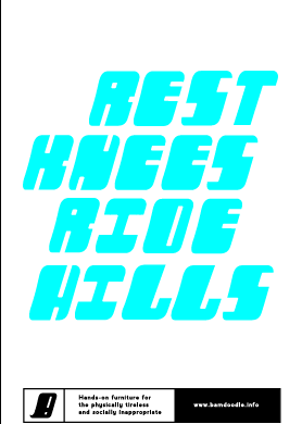
As a quick explanation for what Bamdoodle is I am sticking with this for the moment but it might change. I think this targets the kind of audience intended. I am not sure about 'socially inappropriate', I want to communicate that they have a lighthearted and playful outlook on life. So this may change after meeting with Ryan.

With this poster I am going to print 'Skate or Die' and then using a marker cross out 'Die' and write 'Sit Down', again linking to a light hearted and humorous audience


As Ryan is quite silly and cheeky I think he will approve of this one. This will target an immature and fun loving audience.

Again, linking skating to furniture in a memorable and simple way.

Here are 2 examples of how the posters will look when printed onto coloured stock:


When seen next to each other I think the colours relate well to each other and are slightly referent to skate brands such as Santa Cruz


Typeface and Refinement
Before making more products for this brief I needed to refine the logo as I was using various ones for various things


I am going to restrict the brand to these colours as much as possible, but this may become difficult as the blue is out of CMYK gamut so has to be produced by using stock

After refining the logo I went on to extend the custom letters into a 26 uppercase letter set so that I can quickly make new posters and use the typeface throughout the project.

Promo Pack
I will use this brown envelope- which will have some relevant branding on it

Within the envelope are 2 A4 posters, a product brochure and the coin box

The one-product brochure


The product is featured here, I will meet with Ryan and discuss what other products we could feature in this zine-like publication to fill it out a little bit.


