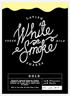
Bottle Labels
I am going to design a range of four labels for four different flavours of milkshake. They should work as a consistent set whilst also being recognisable individually.
PICTURES OF SUPERMARKET SHELVES HERE
I think this looks slightly too 'cow-ey' and childlike
Using a more traditional lock-up with a serif typeface gives the label a more adult feel
I played with the idea of having some drips at the top of the label to give a clear indication of colour and flavour, however this may take away from the impact of keeping it simple
Hierarchy
The top left label is what I started with and from a distance there isn't enough impact, due to a lack of hierarchy in the type and all the stroke widths are similar. Creating a variety of options allowed me to see what worked at a small scale
Elements
These are the smaller logos that will accompany the main logo
Logo posters for the drink. The white version could be extended to promote a range of lighter options.
The final set of 4 labels. I decided not to go with any drips in the end because I am planning on using a wax stamp above the label and I think that them both together will make the bottle too cluttered and messy.


No comments:
Post a Comment