Post-Crit
The challenge now was to make the lines of the flag look even more integrated with each other/ make something interesting happen in the middle.
I tried playing around with how the lines could wrap around each other which turned out to be quite difficult trying to retain the balance and symmetry.
TBM thought that the idea of the flags connecting together was a strong concept to represent community.
This was a version of the original design I took to the crit. The main criticism was that the diagonal line stood out too much and also it could be interpreted as a downward diagonal line as a reference to the state of the economy.
And also that it looks too much like each strip has been placed on top of each other, which it has.
I started to develop the idea of a knot in the centre, however this was still too clunky and couldn't actually be used as the next generation Union Jack
It builds together quite uncomfortably as well
As this was starting to get over complicated I started from scratch and tried to simplify the idea
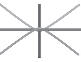
Forgetting the knotting idea I tried to do something interesting with the centre instead.
By losing the white outline strokes it becomes less obviously layered up and the centre becomes more interesting. I also think that the contrasting colours in the centre give it a bit of edgy-ness that Britain often goes for to place them ahead of other countries in design and progress, e.g the olympics logo.
This is the best solution I have come up with, it is true to the idea of equality as no line is in front of or behind the others and still the lines are interwoven to signify strength and support.
This also works well as the built up pattern
This route was becoming too far removed from the original Union Jack and also loses the idea of equality, instead looks like two arrows hitting heads.
And also flipping the flag so that the green line is diagonally pointing upwards to represent growth, positivity and optimism.
I think there has definitely been development since the crit, and in comparison the new version is less obviously layered and also has the hidden green upwards diagonal, rather than a downwards red diagonal.
The flag would probably look better with a blue as it is more familiar to the union jack and is relevant to Britain's identity. However this is leaving out Wales, I will show both versions at the crit tomorrow to see what people would prefer/ think is most suitable.


No comments:
Post a Comment