Visuals
To begin designing for gig posters, I have in mind an idea of the style I want them all to be in using design context as reference.
I began jotting ideas down whilst listening to the bands that I was designing for.
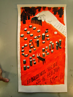
Starting with Cate Le Bon, I went with an idea from a song called 'Ploughing Out', taking the act of ploughing literally from the title I started with a sketch of a tractor ploughing a field. As this was a bit boring I thought it would be more interesting if it was a hand with a comb doing the ploughing and instead of a crop it was ploughing trees. From my research I thought that the posters that have the strangest imagery are most memorable and visually engaging, so that is what I'm doing with this one.
Developing the idea by testing layout and details, the idea is to spell out the name of the artist with the tree stumps that have been left behind
I started working on a bigger scale to see how it would really work, this was helpful as with this I could see that the legibility of the image type wasn't working very well.
I tested digitally what would work best for the stump typography
Using the digital version as a guide I photoshopped the stumps that I have painted in the correct places
This is the piece separated into colour and black layers and hopefully how it will look after being screen printed:
I tried adding halftone shadows to add a bit of depth to the poster but I think that it over complicates it and as I decided through research the most effective ones were the simpler ones.


No comments:
Post a Comment